BOYCE JONES
The Legacy of 13 Coins
LOCATION
Seattle, WA
CATEGORY
Corporate
SERVICE PROVIDED
- Branding Identity
- Logo Design
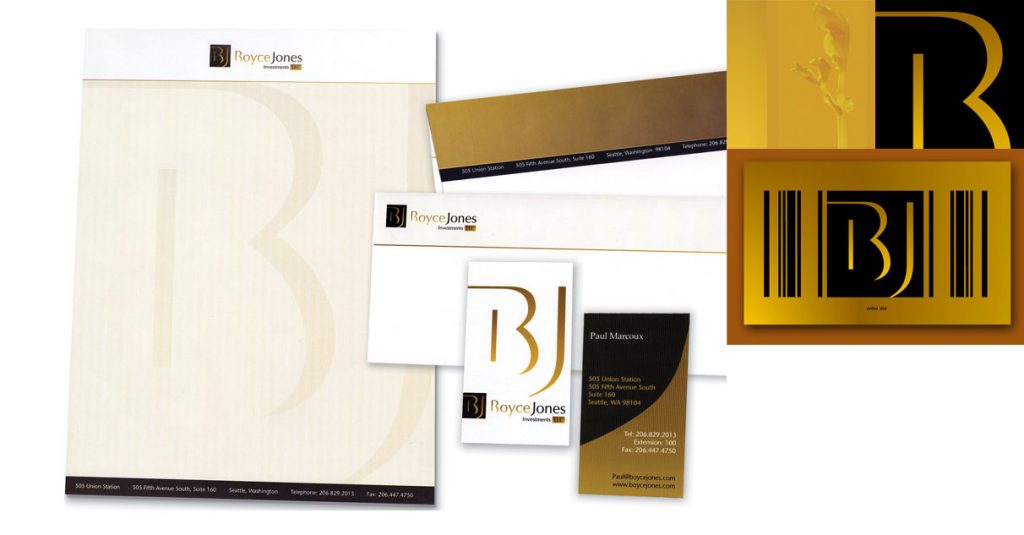
- Stationary Design
Boyce Jones Investments LLC is a private investment group led by successful entrepreneurs Jeanne Boyce Jones and William S. Boyce. Jeanne Boyce Jones and her family owned and operated the landmark Seattle restaurant ’13 Coins’ for 25 years.


The logo design for the new entity needed to communicate the years of solid business experience and expertise the owners bring. In addition the owners wanted to keep some of the character of the restaurant that was part of the family for so many years. The Initial symbol was developed to include a subtle 13 in the shape of the B. The black and gold colors communicate financial strength and hearken back to the 13 Coins decor.
Catch Design Studio
9031 21st Ave SW
Seattle, WA 98106
Tel: 206-322-4323
Fax: 206-322-9177
inquries@catchstudio.com

