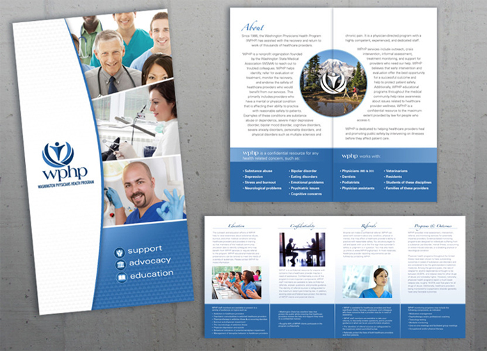
WPHP hired us to redesign their logo that had become outdated and felt sad. They did not want a dramatic departure from the original concept. We chose cheerful blue tones and a more open positive symbol that indicates vitality, growth, and new beginnings. We also create a brochure design and annual report design for them each year.